Mirage of Walls and Spaces
A home is a living space and could be considered perfect only if it could adapt to the changing needs of it’s inmates. 33 Keshav Kunj is a 2.5 BHK apartment located at Mundhwa, Pune, and has been designed keeping in mind the client’s brief, fidelity to the site condition and the daily routine of the inhabitants.
The original brief by the client was to make the house uncongested and to give it a fresher vibe. Therefore, the basic parameters considered while dealing with the apartment were the subtle use of materials and fresh color palette which helped to make the spaces look big and user-friendly. The foldability of various functions acts as a key factor while dealing with the compact carpet space of 70 sqm. A big advantage of the design is the way the walls have been used not just as simple dividers, but also as storage for all the paraphernalia of living. As the height maintained is good, space feels larger than it is. Building on this idea of continuity, the same flooring has been maintained throughout the common areas of the house.
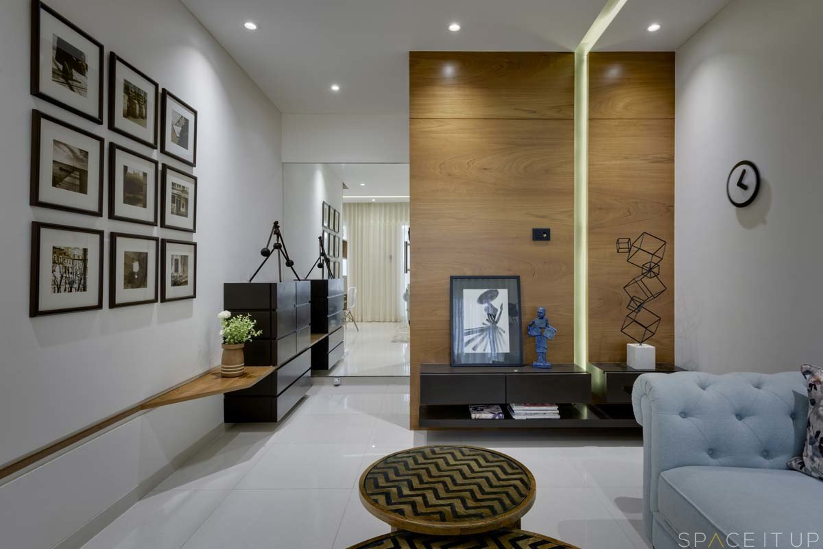
Similarly, the ceiling is kept simple with minimum embellishment. The living area is designed with a minimalistic approach, highlighting only a few iconic loose furniture and a sculptural dining unit. The small foyer opens into the main living area which is narrow. To overcome this, the folded geometry of display shelves encloses subtle openings so that the eye is drawn into the dining area beyond, thus creating the illusion that the space is larger. The indirect lighting strip starts all the way from the TV console to the ceiling and ends above the dining table as a sculptural hanging.


